Well, hopefully moving on. Here's what I've been doing!
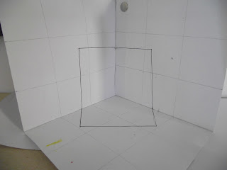
Firstly I made an attempt at creating my own perspective shape in a corner. A simple square. Not terribly interesting but just wanted to give it a shot. It was an awful lot more difficult than I had anticipated. I started out with these 3 surface being blank and then went back and drew a grid on them to give myself a better reference. Then I drew a simple square straight onto the photo. This would be what I referenced back to to draw onto the 3D piece. The results were alright, I guess. The photo does it better jutice than actually seeing it in person. For now I'm going to leave this idea, just for a little while. But when I come back to it I want to focus on just 2 surfaces and see where that gets me.
Again, i jumped back an idea and started looking at the juggling balls again (i think I mentioned that in the last blog). But this time, I made an attempt at a 3D piece. With results that I was quite proud of. Even if it is a little crude looking. But sure, can't hurt to have a go. Obviously, I need to differentiate between the different colours of the ball and that was easily achieved with the thin, malleable and dull wire.
One day then, when I was away from college, I got my new favorite idea! I passed the Ennis Court House where I saw a grossly overwight lawyer type guy. And I thought to myself "All you think about is cake all day isn't it?" And I imagined a cartoon thought bubble appearing above his head. #then scrambling for any piece of paper I could find I wrote my new idea down!
Clearly, I judge people very fast.. And it's even been pointed out to me that I do so. So I figured I could run with that. I decided I'd go out into O'Connel street in Limerick (a short walk from the college) and take a picture of a crowd and just write above them in Sharpie what I thought of the people present. Or what they might be thinking. The idea is, that these people are present in my space and these are my perceptions of these people. It could be an interesting study of people and of me as well. This, of course, brings up privacy issues. But I'll worry about that later. Soon I remembered a music video from a few years ago from All Time Low. While they aren't very good, the video for Weightless really does reflect what I want to do.http://www.youtube.com/watch?v=TpG3BxRctQ4
It was then suggested to me that I try something like this. In a video of a crowd, with signs and thought bubbles shadowing the people. EXCITED!!
Tuesday 25 September 2012
Tuesday 18 September 2012
Progressing Through Space
Well, for the first period of college I've been thrown right in the deep end with studying space. In the beginning I was focusing on one idea. The path juggling balls follow and the shape inbetween, that the paths create. Which lead me onto movement in space and the different ways movement could be depicted in a still image. My favourite being the memory of the ball. Like the blue ball will leave a blue path behind it. Like a comet.
But then after a talk with a tutor, I was told to broaden my horizons. Throwing down EVERY idea I had. Good bad and the ugly. Then I began to enjoy the whole experience an awful lot more!
I noticed a lot of my ideas were sculptures or installations. Two thing that I've never really gone near before. Some fairly linear things and then abstract stuff about 'imaginary space' which I thought would be really cool! Such as, a metal circle on a spinning axis. Then when spun at a high speed it would seemingly create a bubble when actually it's just a 2D shape at many different angles. But one thing about it was annoying me. That the pieces weren't involving the viewer enough. It is 'To Sense My Space' and that should involve the viewer as well.
One of my favourite ideas was a pink, pretty, girly castle. A large box of a thing in a gallery. The point was that the viewer would have an idea built up in their own mind of what the space inside would be like. A pink, prety room full of niceness and kindness. But instead it would be something completely unappealing and unexpected! The first thing that came to mind was a lone clown in a harshly lit room. Then I thought of gigantic versions of tiny things e.g. spider/ rat. But again a tutor talked sense to me saying "It would be a one trick pony" like a fair ground haunted house. Fun for a second then the effect wears off and it wouldn't really be remembered. Quickly push THAT idea aside.
Finally, what I'm working on now.I was reminded me of this form of street art where the viewer must stand in one specific spot to see the proper image. Otherwise the image seems stretched and distorted. But when viewed correctly it will almost seem to be floating in space. I'm really excited about this because it uses the space of the gallery floor instead of involving space in the work too much while also involving the viewer. My original aim. Now to take his original idea and make it completely my own!!
Subscribe to:
Posts (Atom)